For customers who have enabled Vulnerability-based Alerting, note the following changes to these panels:
|
Security officers, development managers and DevOps engineers would like to see their security posture over time.
To evaluate it, it requires understanding the trends pertaining to the key security KPIs related to an organization or a specific application or project.
These KPIs indicate the trends over time of getting better or worse with regards to handling security vulnerabilities, considering the number of outstanding vulnerabilities, their severity, the average remediation velocity and the effect of newly published vulnerabilities on the organization or specific apps and projects.
They also allow managers to compare these trends among different business units, applications and projects, and report back on the security posture trends.
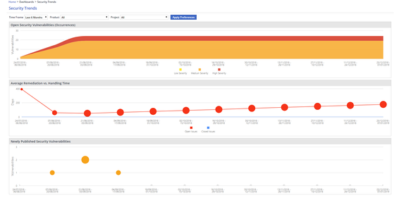
The Security Trends Dashboard presents users with a view of the organizational security posture over time, based on the following:
Number of open security vulnerabilities
Average remediation and handling time of security vulnerabilities
Effect of newly published vulnerabilities
The dashboard is mainly intended for the organization's administrators, security officers, and application R&D managers.

Open the WhiteSource home page.
From the menu bar, select Dashboards > Security Trends Dashboard. The Security Trends Dashboard is displayed.
Use the dropdown menus to select the following:
Time Frame: Select the last 3,6, or 12 months.
Select the scope: For an organizational scope, select All in the Product, and Project dropdown menus. You also have the option to select a specific product or project.
Finally, click Apply Preferences.
You have the option to click on a chart in order to be forwarded to the relevant report with the same scope and interval settings as in the chart. |
This chart displays the number of security vulnerabilities over time for the selected context (organization, product, or project) per vulnerability severity. Expanded information on a charted data point can be displayed via a tooltip when hovering the mouse pointer over that data point, as demonstrated on the screenshot below.

This chart displays how average remediation and handling duration for security vulnerabilities changes over time. The chart features the following information:
The average handling time for security vulnerabilities that were closed within the month preceding the date of a given data point.
The average handling time for security vulnerabilities that are open at the date of a given data point.
Data points are displayed in one of the following colors:
Red (for data points indicating open issues)
Blue (for data points indicating closed issues)
The sizes of the data points correspond with the number of issues.
Expanded information on a charted data point can be displayed via a tooltip when hovering the mouse pointer over that data point, as demonstrated on the screenshot below.

This chart displays the number and effect of newly published security vulnerabilities at a given point in time for the selected context (organization, product, or project). Expanded information on charted data points is displayed through a tooltip as demonstrated on the screenshot below. Each data point reflects vulnerabilities that were published within the month preceding the data point's date.
Expanded information on a charted data point can be displayed via a tooltip when hovering the mouse pointer over that data point, as demonstrated on the screenshot below.
Data points are displayed in one of the following colors:
Yellow (for data points whose highest severity is low)
Orange (for data points whose highest severity is medium)
Red (for data points whose highest severity is high)
The sizes of the data points correspond with the number of libraries affected by newly published CVEs.

You have the option to click on any chart in order to be forwarded to the relevant report with the same scope and interval settings as in the chart. |